The core challenge of the project was managing Brand Equity. The legacy “U” and wing symbols were deeply embedded in the customers’ minds. A radical shift could have disconnected the brand from its history.
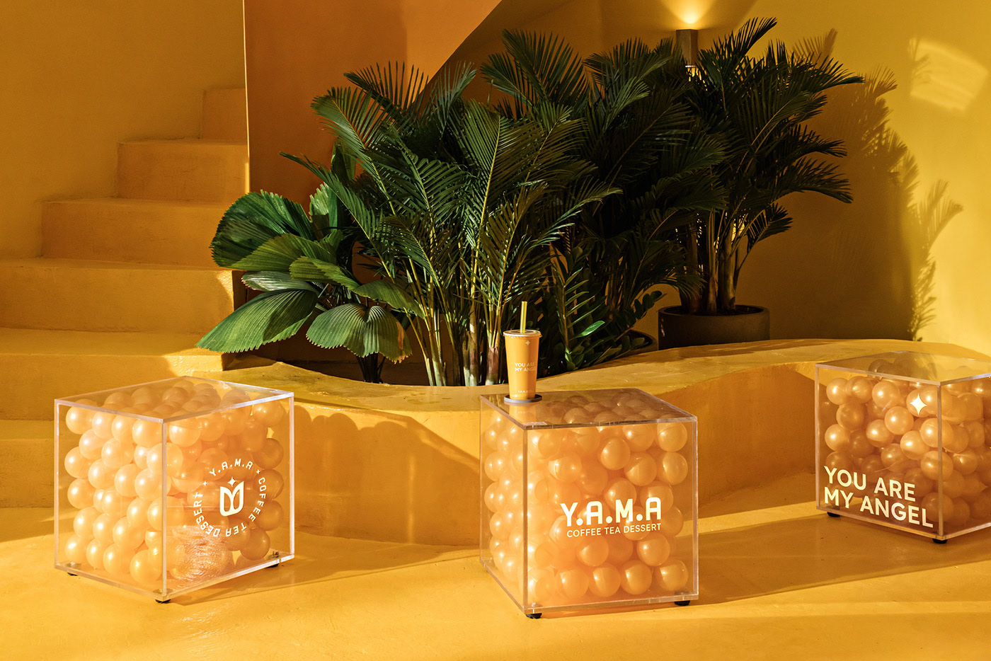
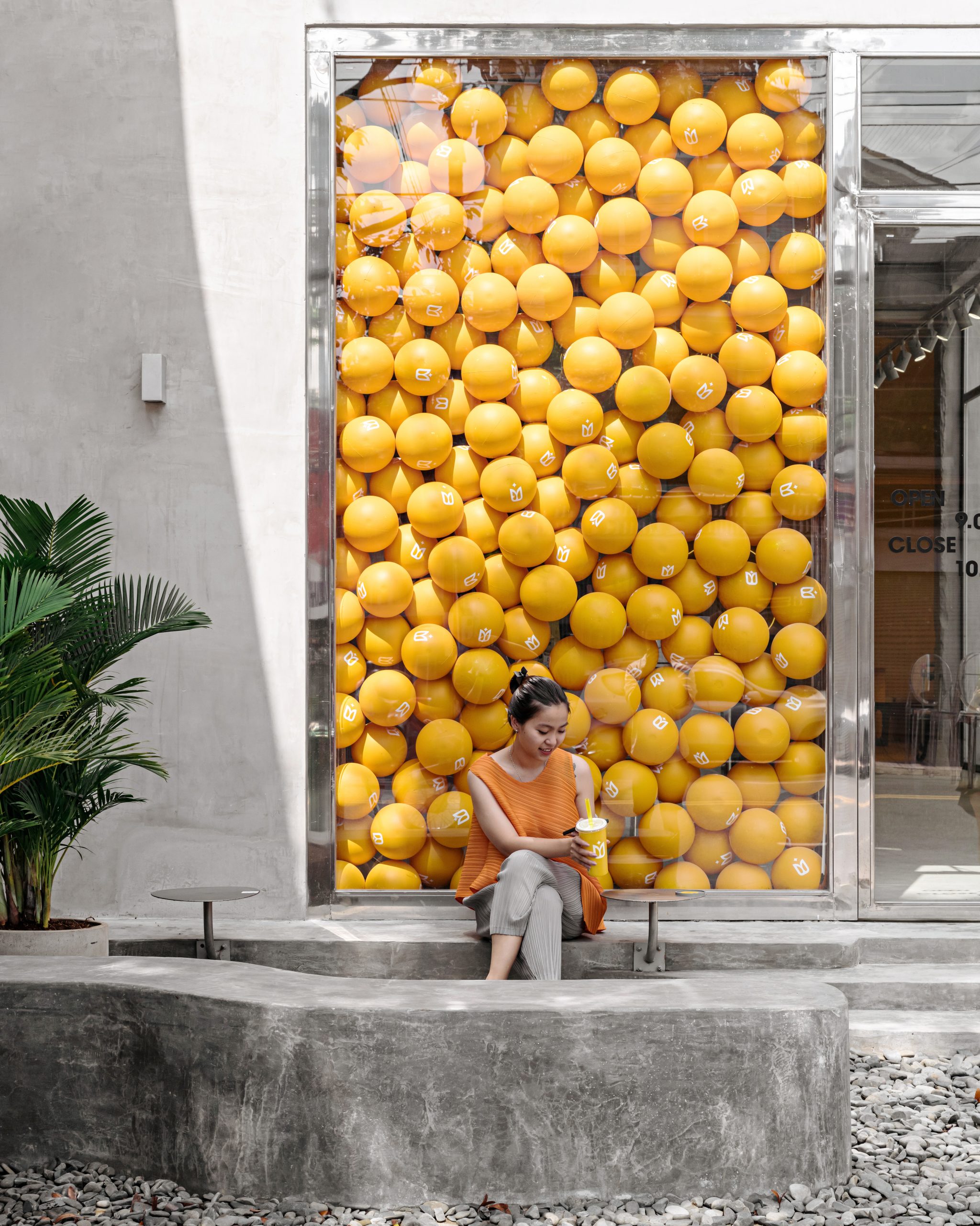
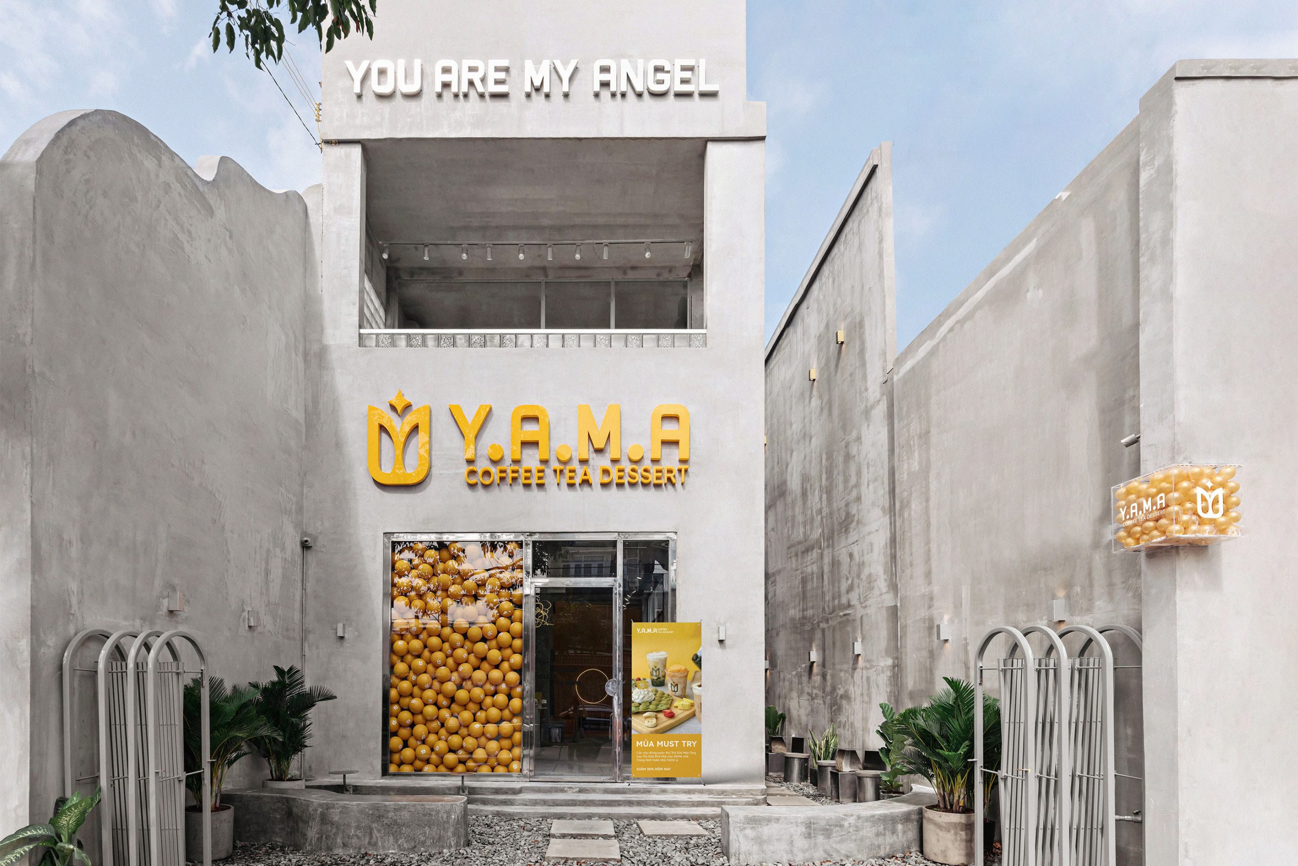
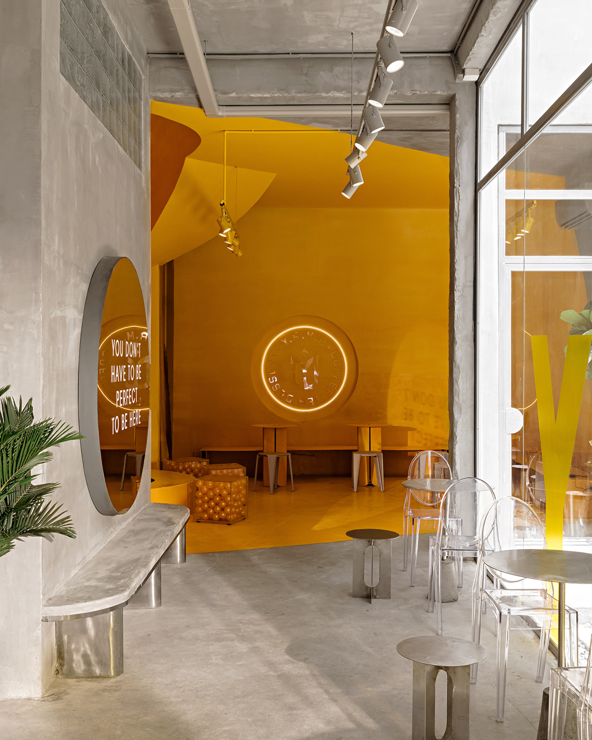
The new concept was built on the intersection of Heritage and Modernity. Instead of maintaining a literal, illustrative style, the direction shifted toward a Monogram approach. The identity was designed to be an organic extension of the “Industrial” architectural space balancing the raw, concrete textures with the vibrant, energetic glow of the brand’s signature yellow.
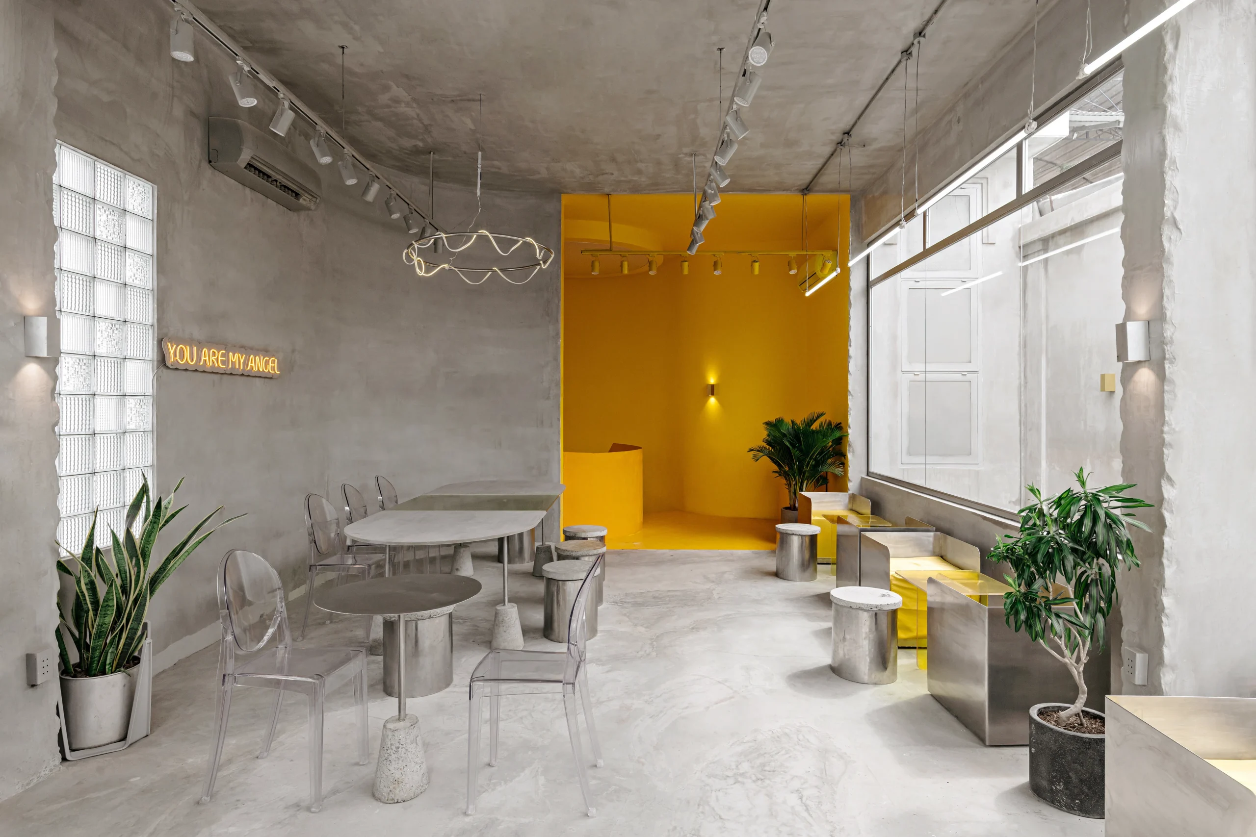
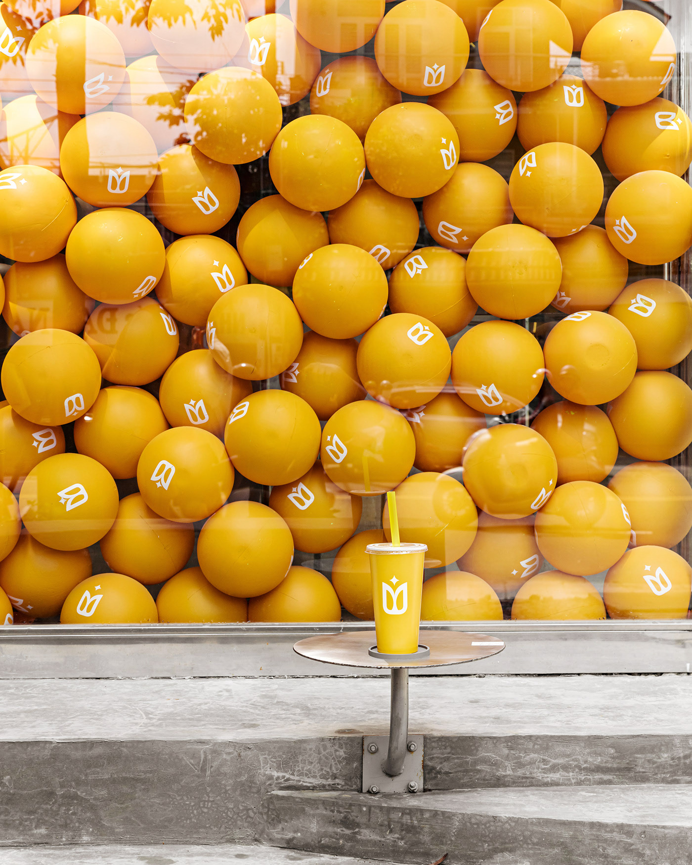
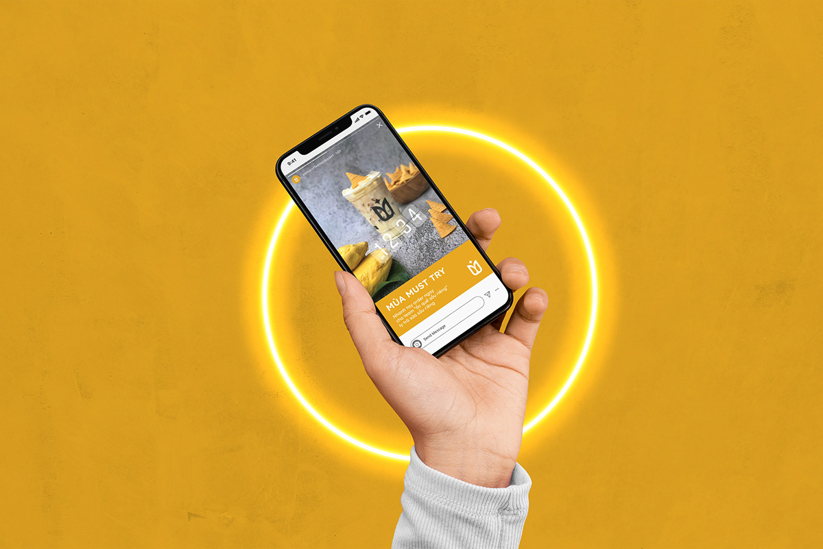
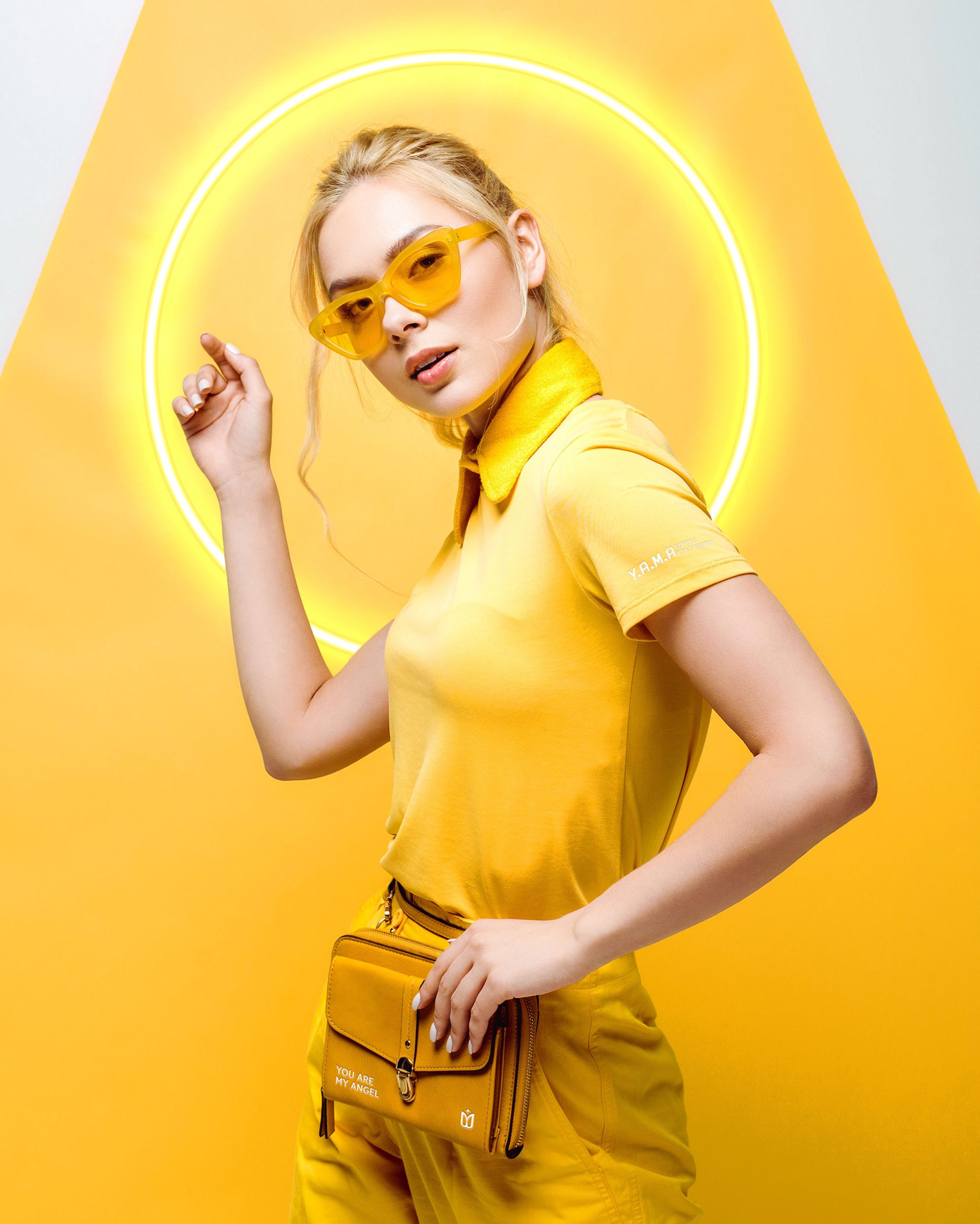
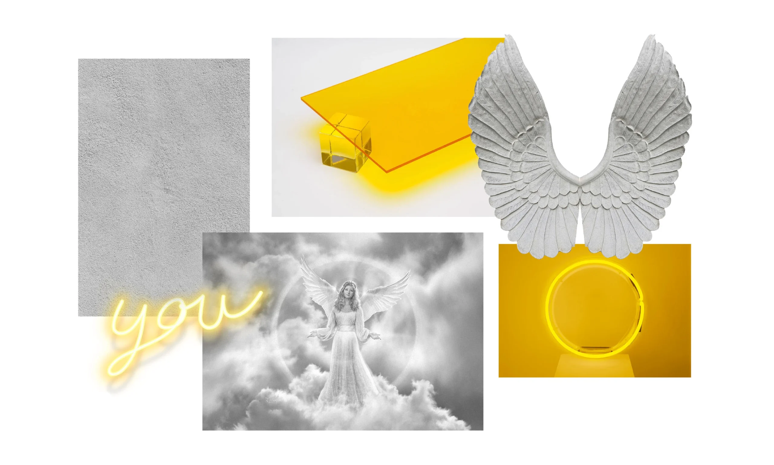
Visual Metaphor: Replacing traditional “Angel” imagery with a “Modern Halo” using neon light bars and circular geometry.
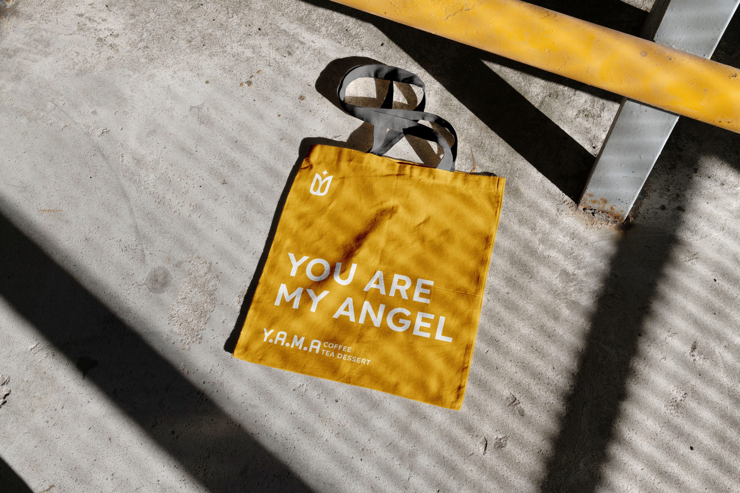
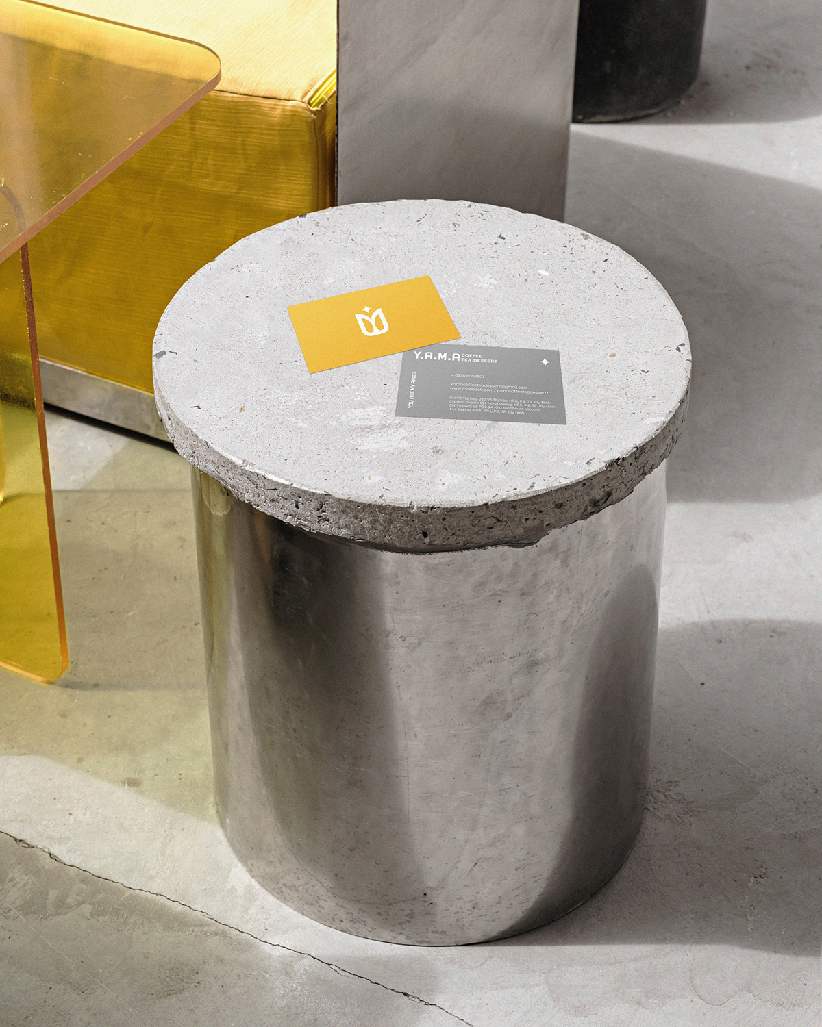
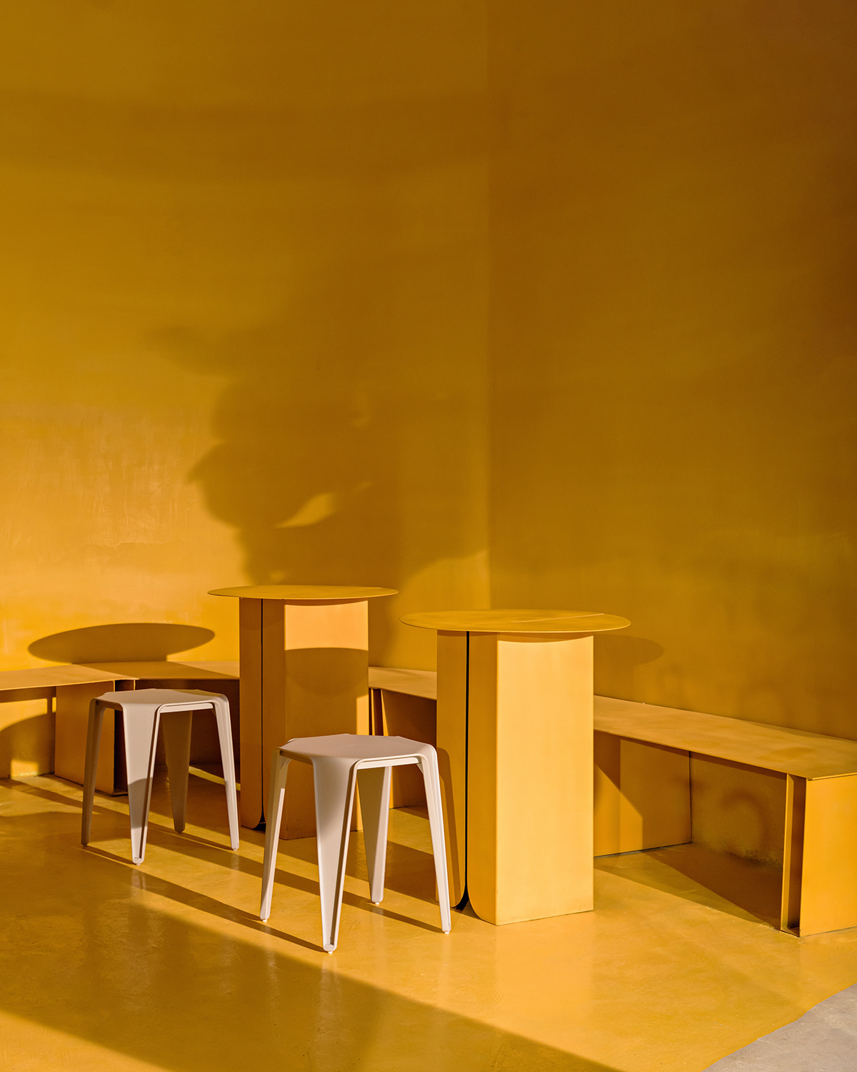
Materiality: A curated contrast between the rough, tactile texture of raw concrete and the vibrant energy of yellow acrylic.
The new logo is a sophisticated geometric structure where every stroke serves a strategic purpose:
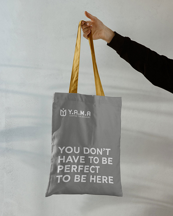
The Central “U”: Serves as the primary anchor, preserving the “You” phonetic heritage of the brand.
The Symmetrical “M”: Elegantly stylized to represent a pair of abstract wings, symbolizing the “Angel” in a modern, scalable form.
The Minimalist Star: Inspired by the neon light installations at the stores, this element replaces the literal angel imagery with a subtle spark of “light”.
Total Integration: The entire Y-A-M-A acronym is woven into a single, unified symbol. This isn’t just a graphic exercise; it’s a solution that encapsulates seven years of history into one modern mark.
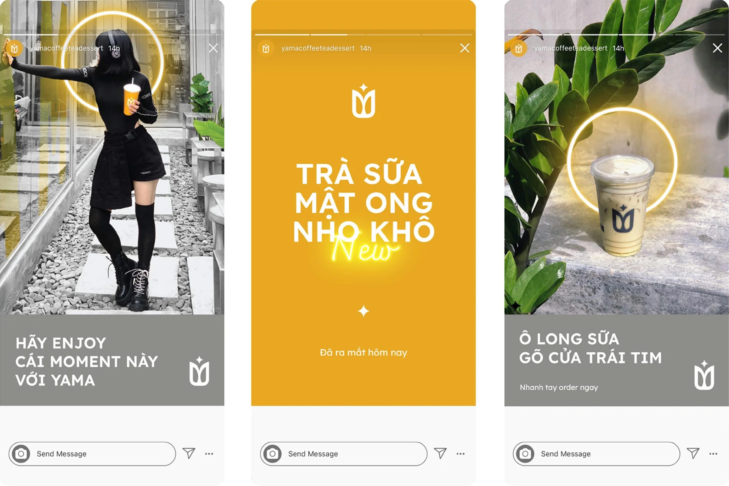
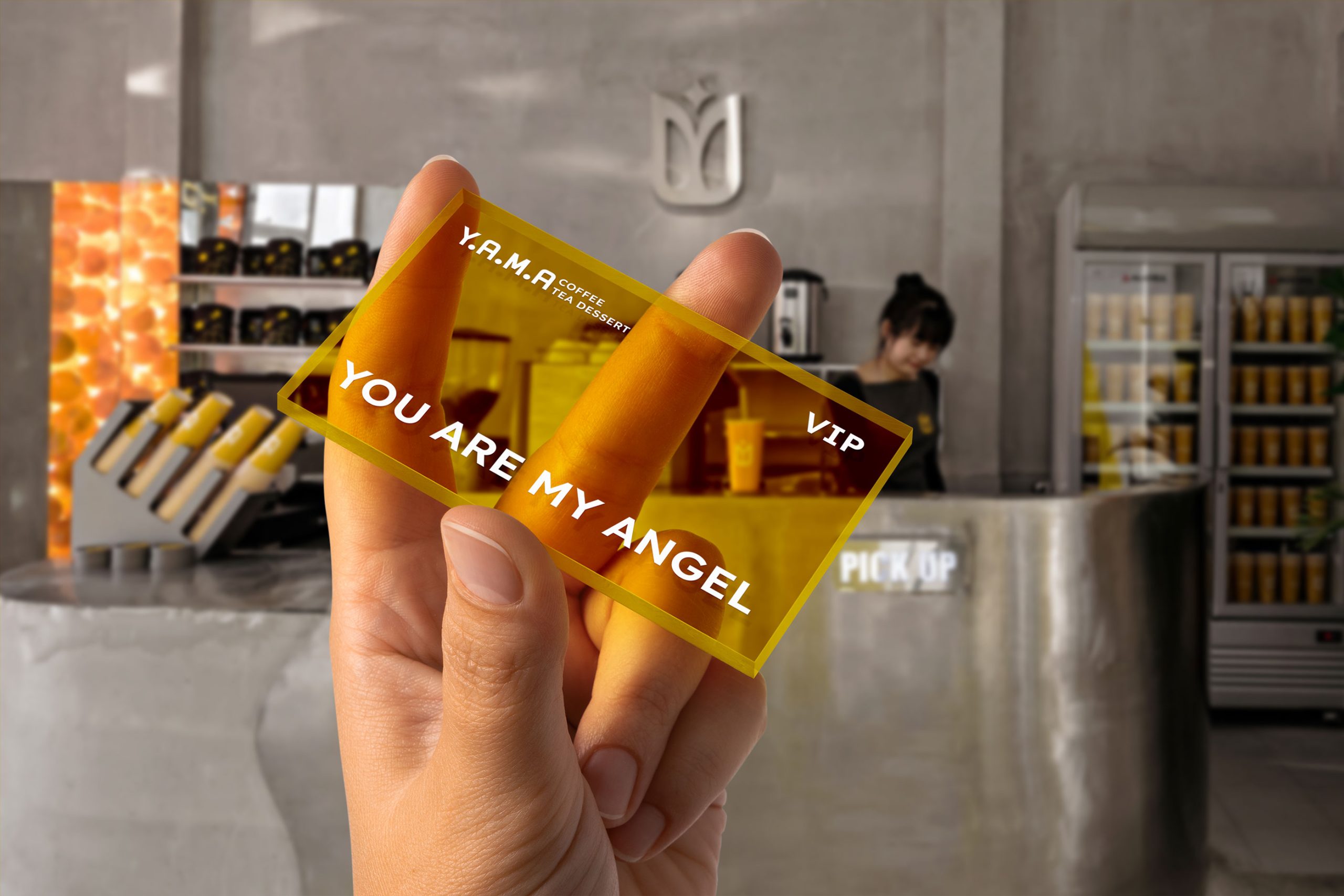
The visual system, titled “The Angel’s Halo,” creates a cohesive dialogue between physical space and brand identity.
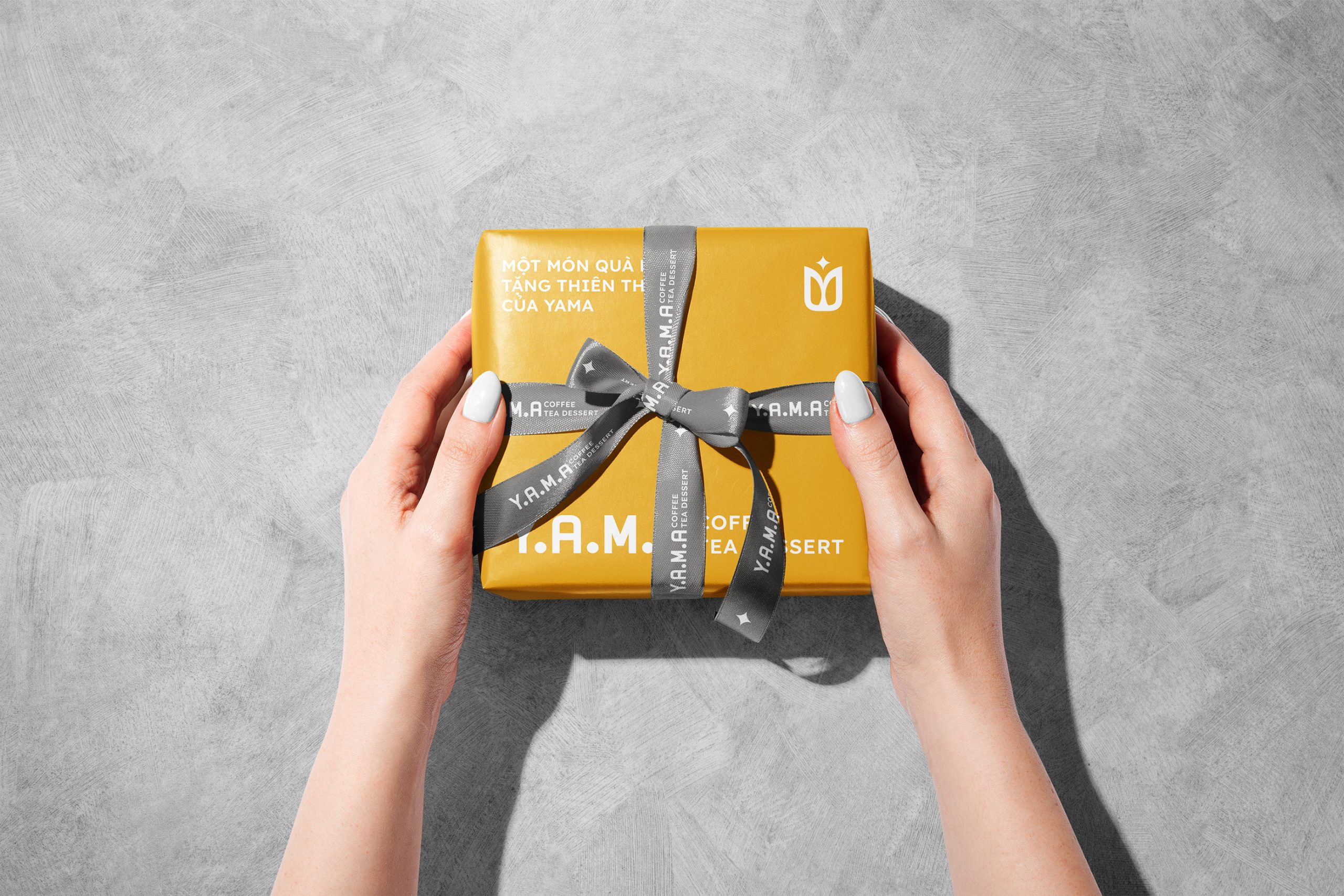
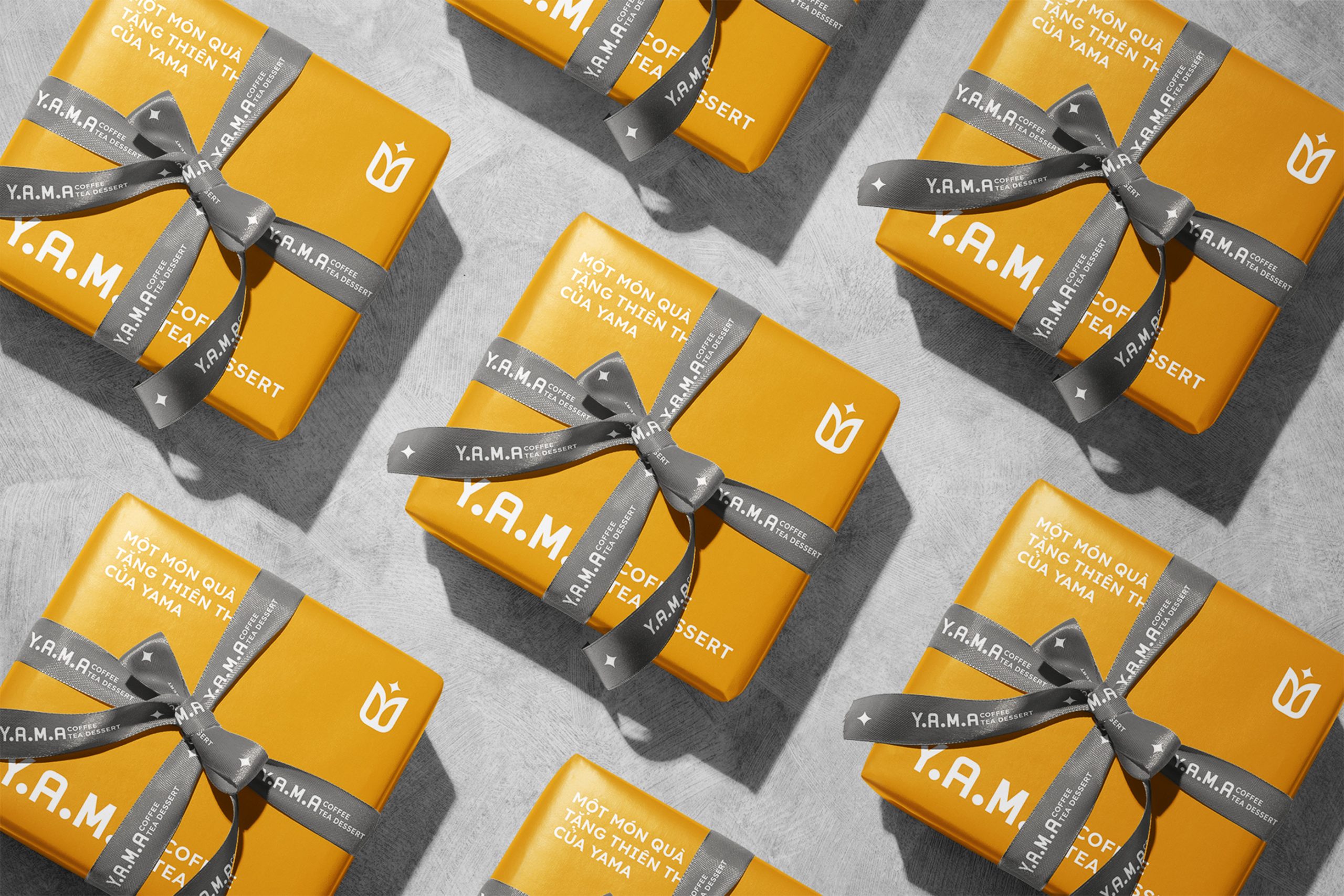
Typography: We utilized Lexend for the system font. Its rounded terminals provide a friendly atmosphere, while its modern structure maintains a premium, professional edge.
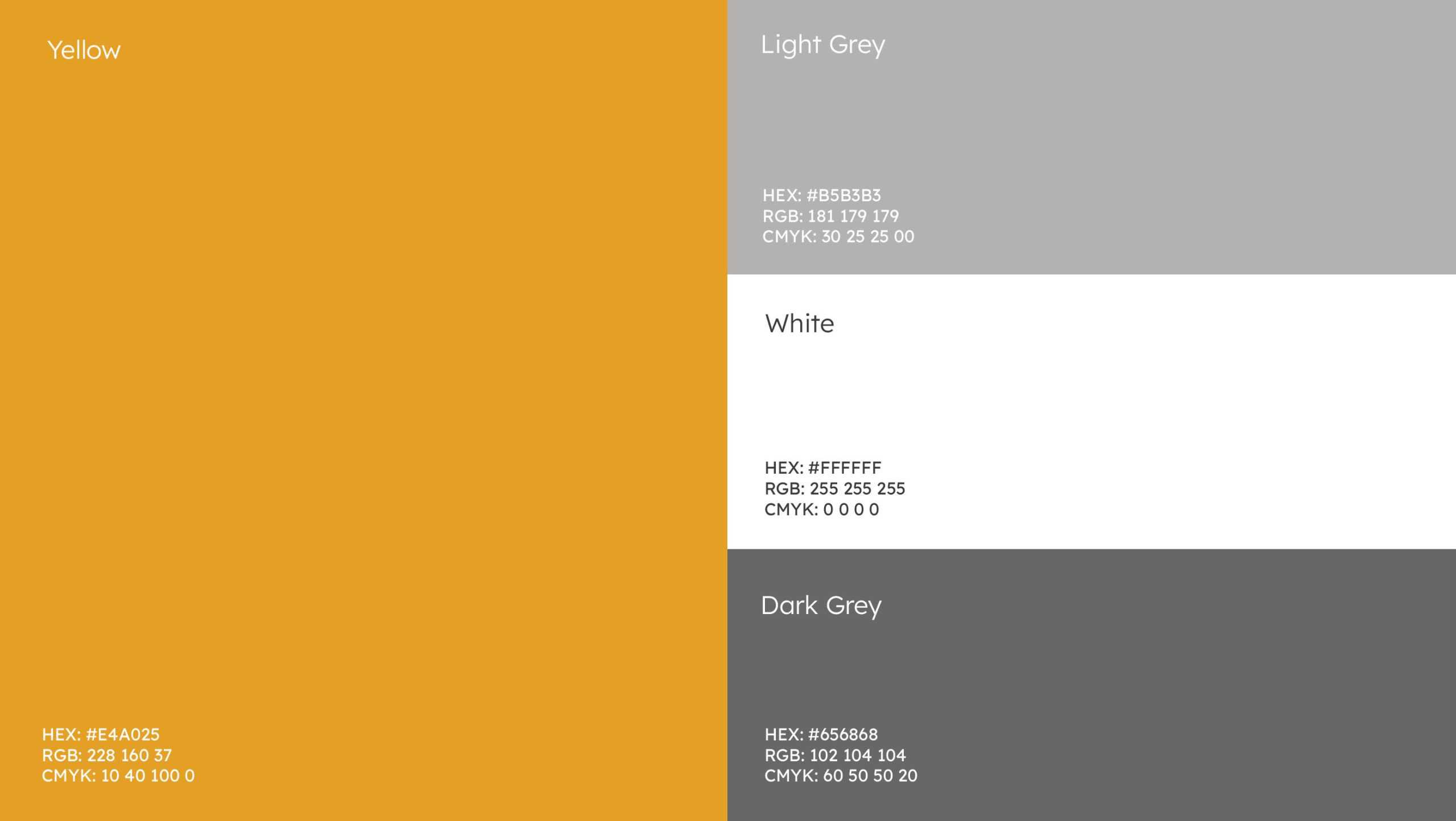
Color Palette: Yellow is the hero. In a competitive F&B market filled with neutral tones, this vibrant color ensures immediate top-of-mind awareness. It is balanced by a palette of Whites and Greys to reflect the store’s architectural materials.
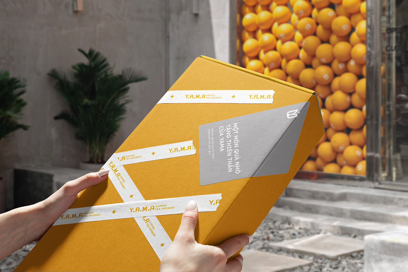
Iconic Layouts: Slender neon light bars and the circular “Halo” were translated into minimalist layouts. This ensures a seamless transition between the Online and Offline experience, from a social media post to the physical cup in a customer’s hand.