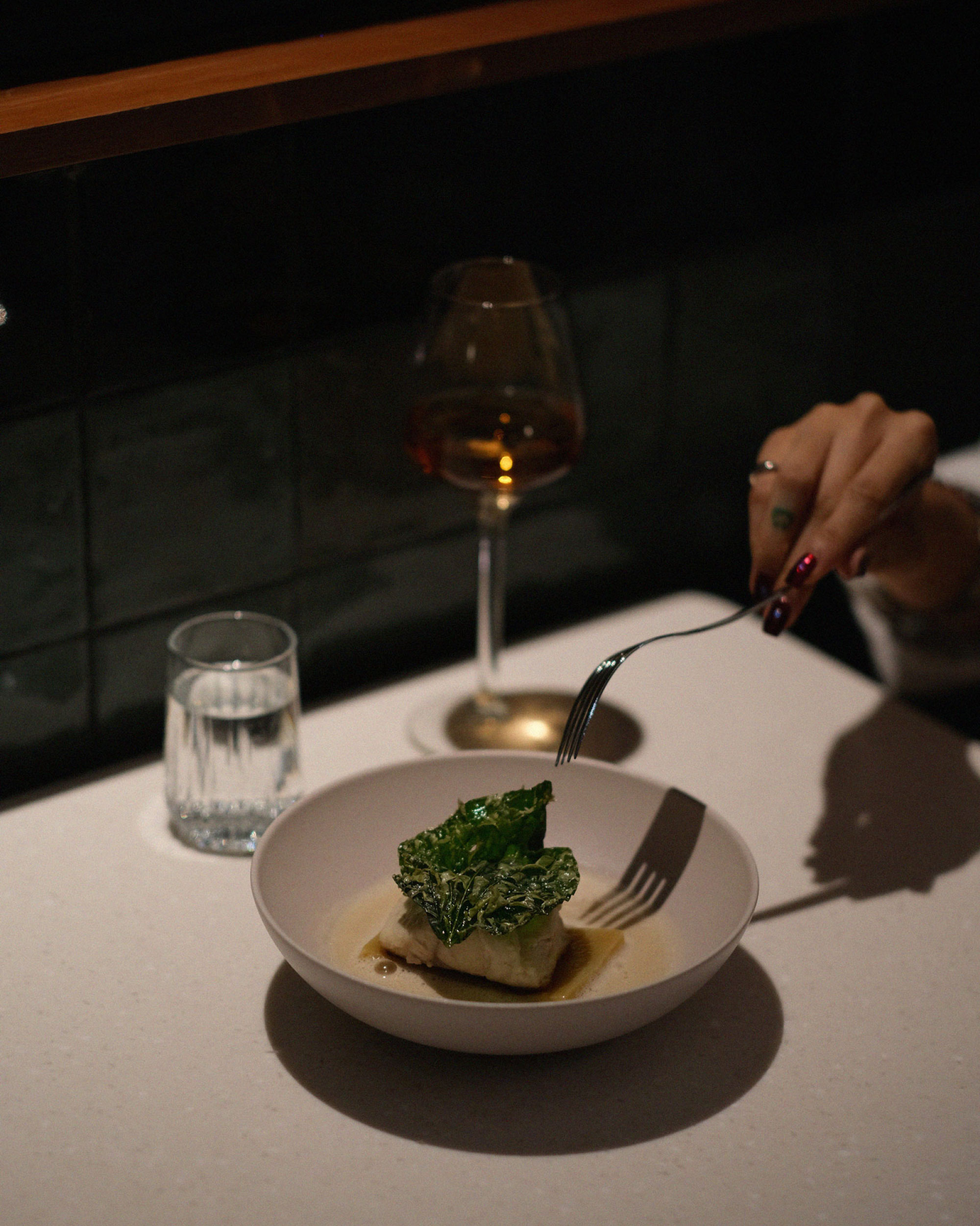
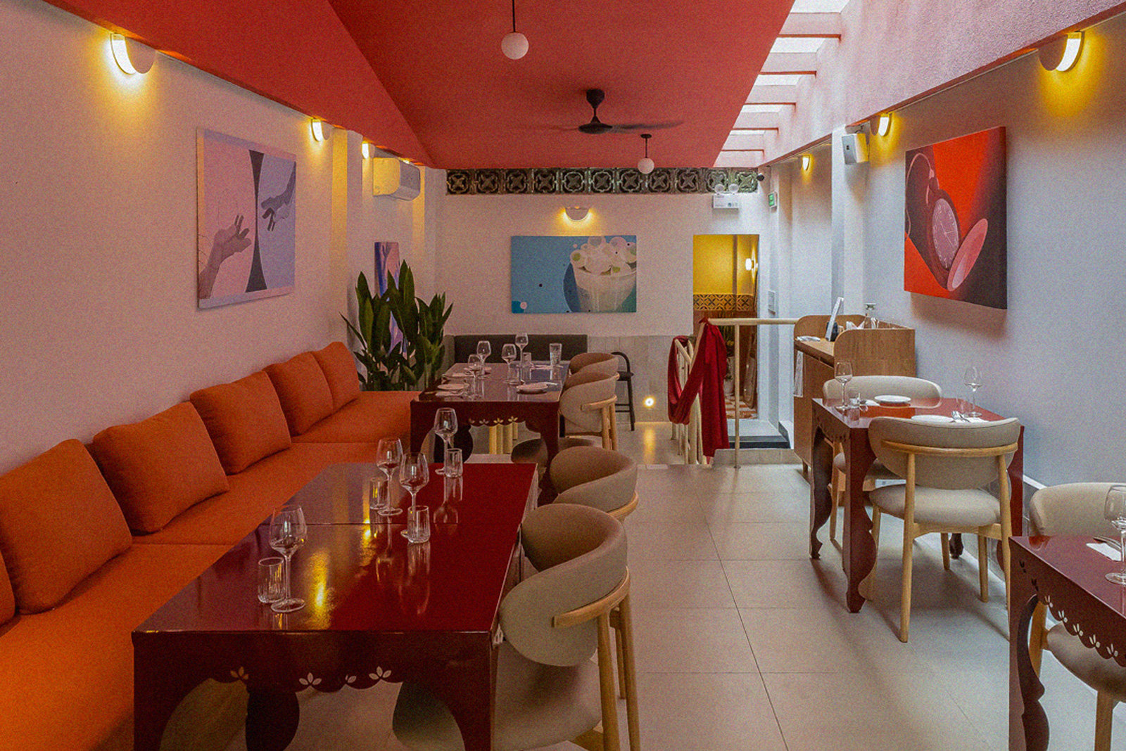
The brand strategy was built on the synergy between architecture and identity, drawing inspiration from Roman community spaces where tranquility takes precedence over noise.
Core Philosophy: “Nothing is allowed to create a sense of urgency”.
Atmosphere: A sanctuary that blurs the boundaries between being “Instagrammable” for attraction and “Authentic” for retention.
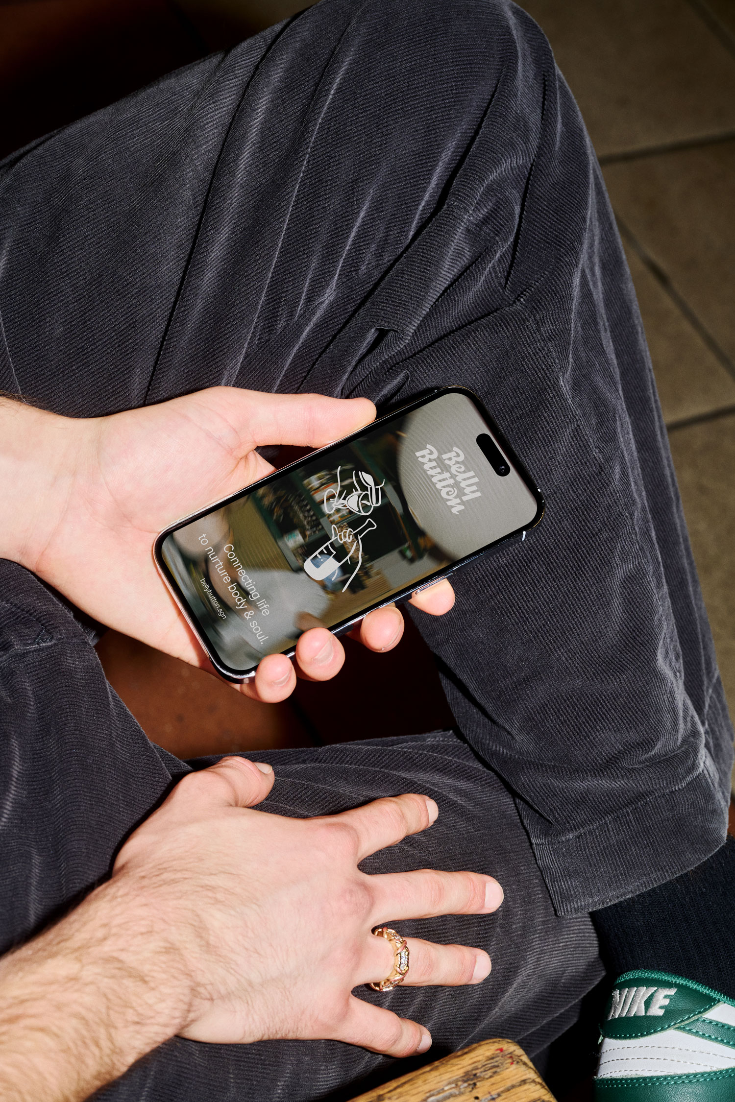
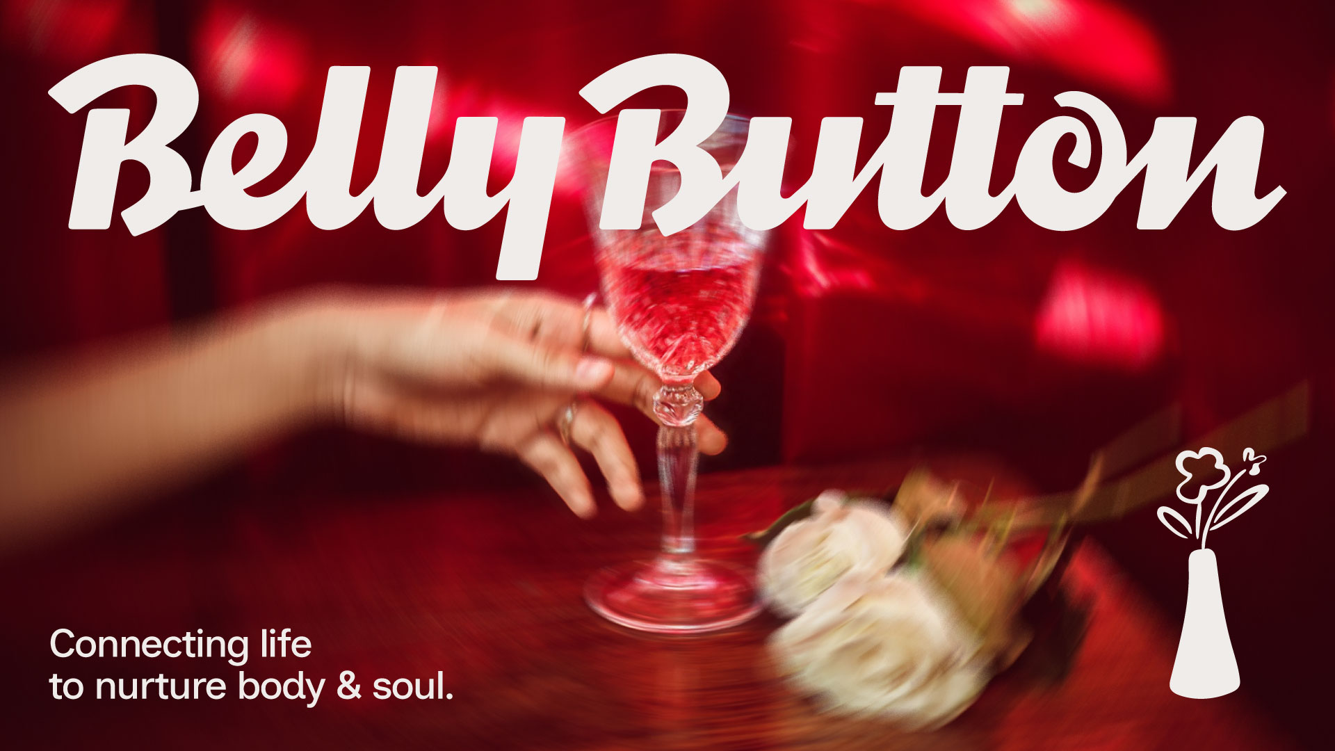
The Narrative: Utilizing silence and negative space as core design ingredients, the brand invites customers to “navel-gaze”—a purposeful play on words symbolizing introspection and deep connection.
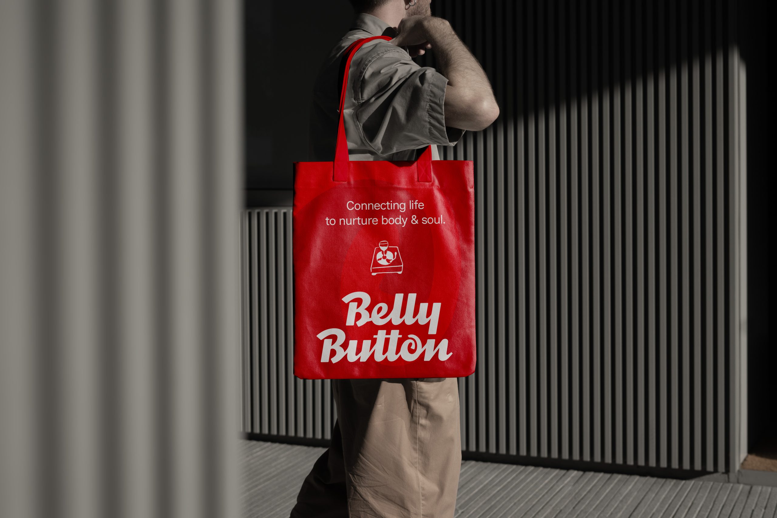
The logo’s heartbeat lies in the stylized “o”—a delicate swirl representing the navel. It’s a visual metaphor for the origin of life and the flow of emotions. The hand-drawn curves break the rigidity of modern design, adding a touch of playful unpredictability that says: “Life is a bit messy, but it’s beautiful when we connect.


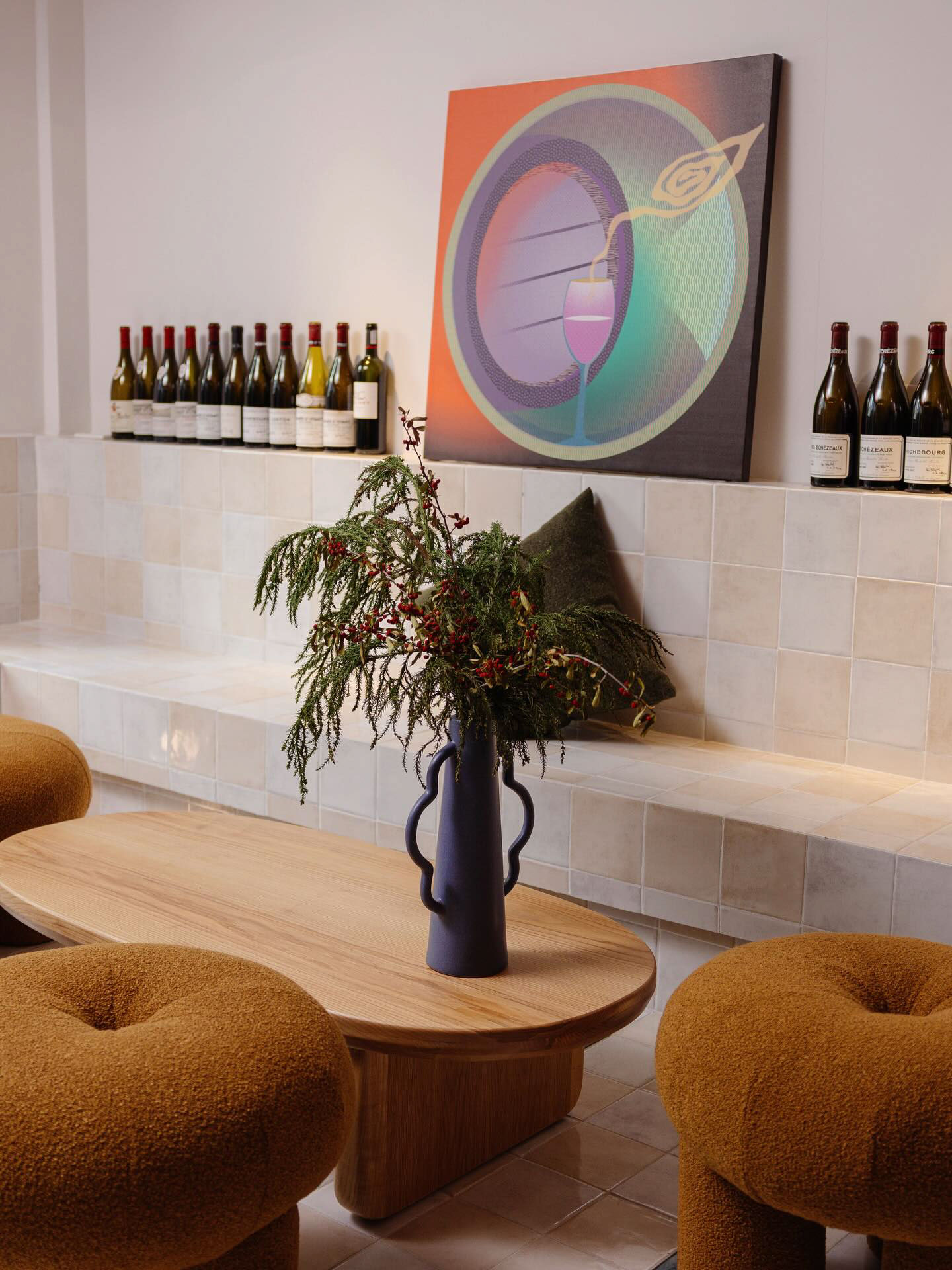
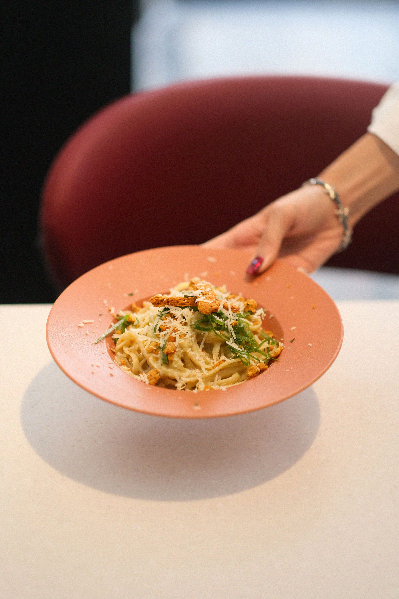
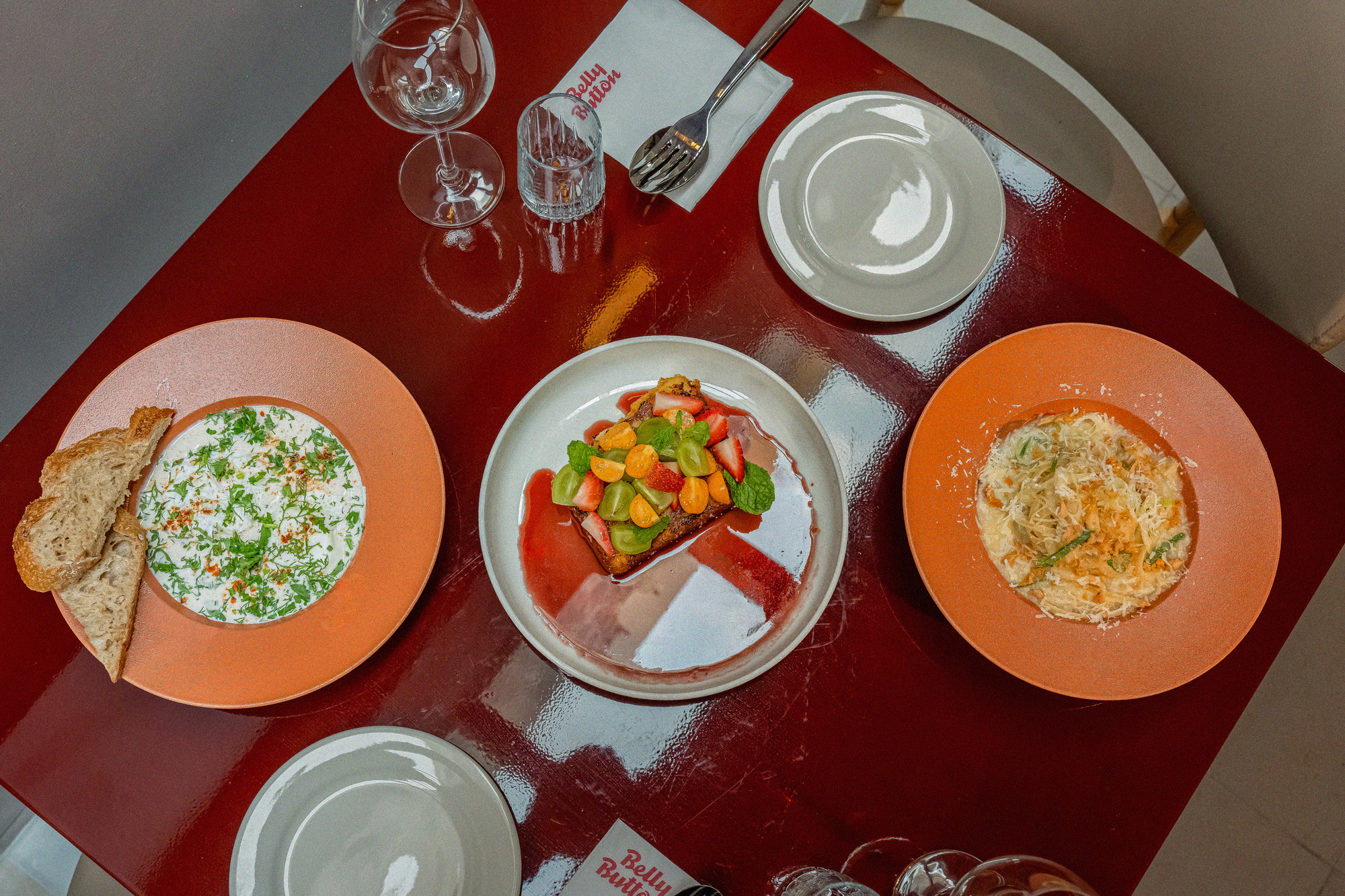
The visual system establishes a sustainable and tactile identity through contrasting materials and organic tones.
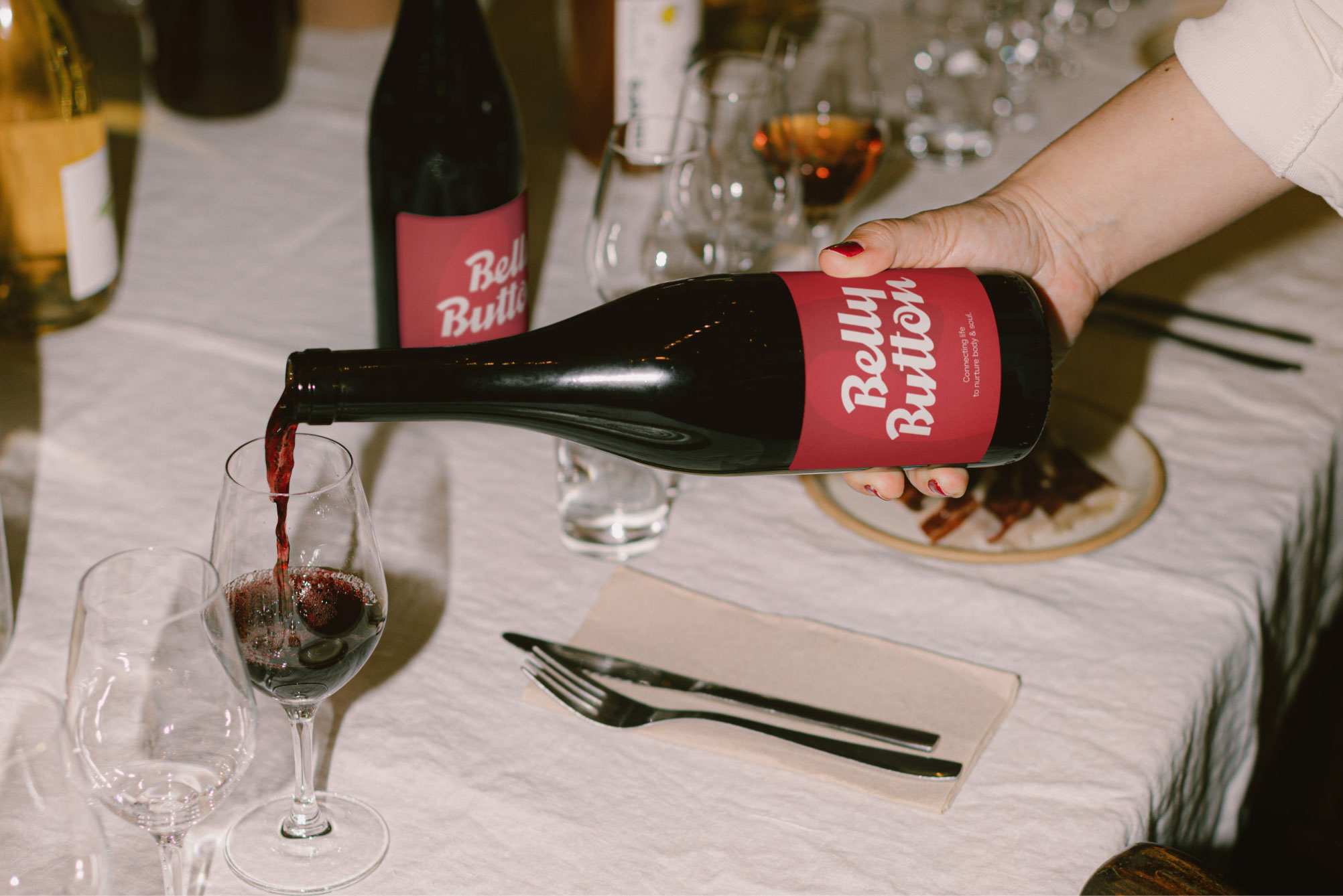
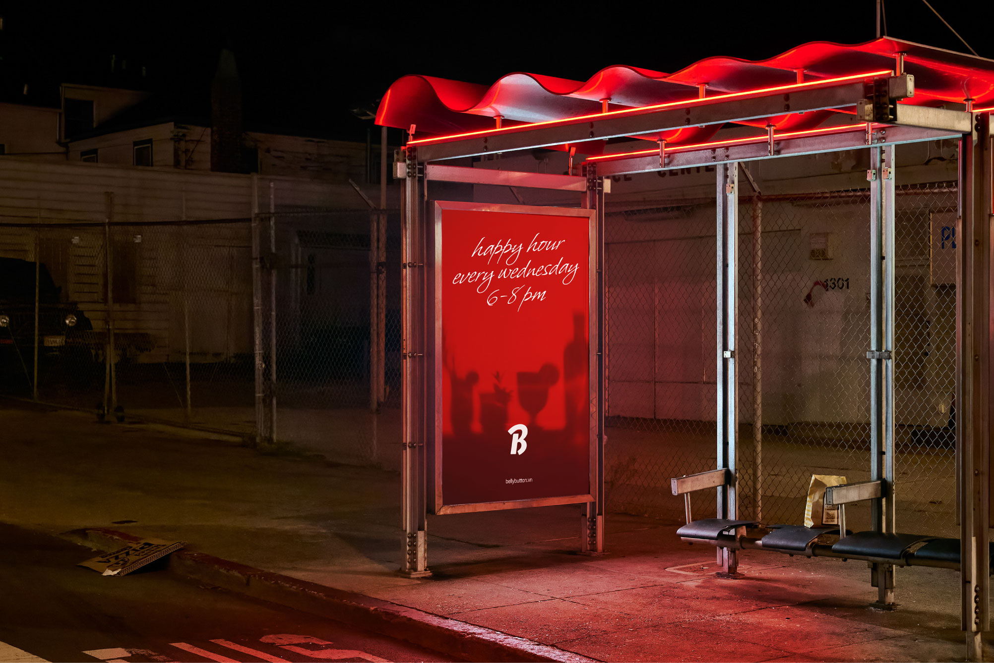
Color Palette: An earthy system (Cream, Terracotta, Brick Red, and Dark Brown) reminiscent of natural light filtering through stone.
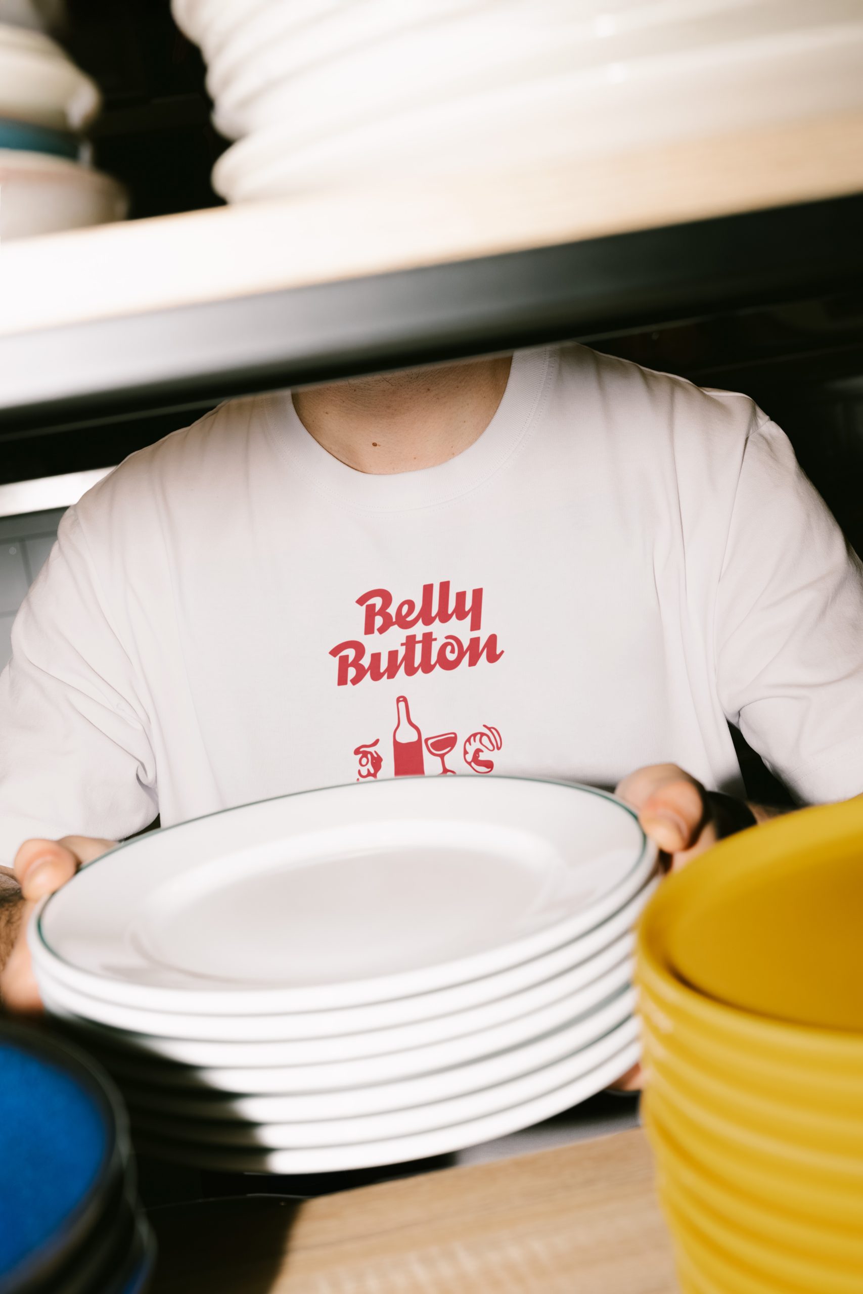
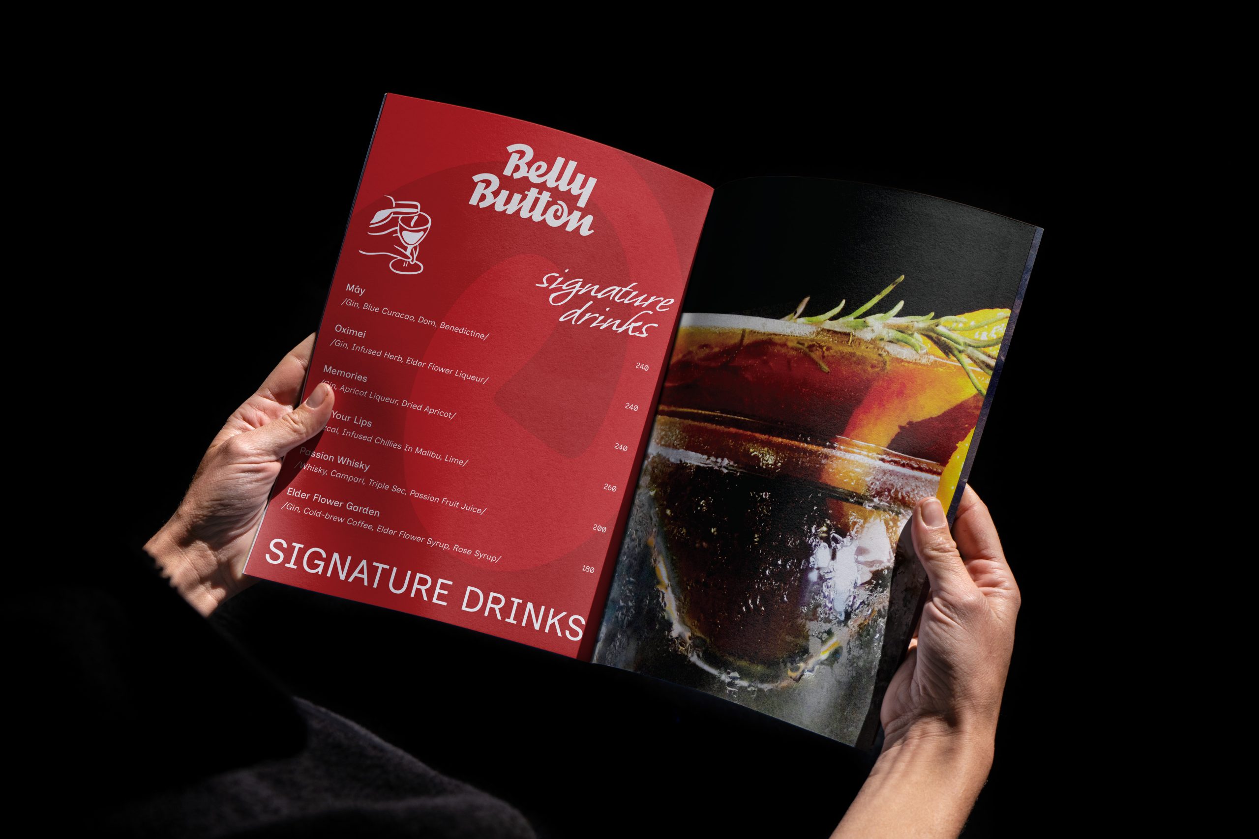
Typography Duo: A contrast between Whisper (a sensual, deep display script) and Inclusive Sans (a clean, neutral body font).
Graphic System: A red line-art illustration style captures candid, everyday moments within the Bistro.